3 minute read
Designing eLearning that sticks
Imagine this scenario: you’ve been assigned a mandatory internal training course but it slipped your mind and is now due by the end of the day. You launch the course but find yourself navigating through an eLearning course that is cluttered, visually unappealing and, worst of all, difficult to follow. You quickly lose interest and struggle to retain the information on screen, so you end up rushing through and completing the course in mere minutes.
You’ve managed to finish and receive your completion status on time; but how much did you really learn?
To prevent your learners facing such a scenario, it is crucial for eLearning developers to make use of graphic design, to transform content into visually effective learning journeys.
So, how do graphic design principles go hand-in-hand with eLearning?
1. Alignment
Strategic alignment of elements on the screen helps guide learners’ attention and visually connect related content. This not only enhances understanding of complex concepts but also reduces cognitive load by creating a more intuitive layout.


2. Balance
Balance refers to the distribution of visual weight across elements on the screen. Whether it is symmetrical or asymmetrical, a well-balanced layout ensures no part of the screen feels too cluttered or too empty. It creates visual harmony and reinforces the message you want to communicate.
3. Contrast
Contrast helps highlight important information and adds visual interest. It’s also essential for ensuring your eLearning content is accessible to all learners. Use contrasting colour palettes and font weights to improve readability and draw attention to key elements.

4. Colour
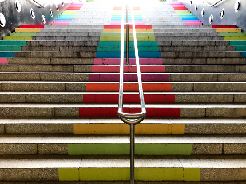
Colour plays a significant role in eLearning design. It can highlight important information, guide attention and reinforce branding. Most importantly, colour evokes emotion. For example, a dark palette can convey seriousness and professionalism, whilst yellow hues suggest joy and boldness. Use colour playfully to enhance engagement and maintain visual interest throughout your learning experience.

5. Visual hierarchy
Visual hierarchy helps organise content to guide learners through the material. Using different font sizes, weights, colours and subtle animations can emphasise key points and create a logical flow of information, usually from top to bottom, left to right.
This fosters a sense of community and helps integrate them into the company culture.
6. Proportion
Proportion ensures elements are sized according to their importance. Consistent and logical sizing makes layouts more visually appealing and helps your learners intuitively prioritise information.

7. Negative space
Also known as white space, negative space is crucial in eLearning design. It gives your layout breathing room, prevents clutter, enhances readability and creates a harmonious balance that keeps learners engaged with the content.
8. Repetition and rhythm
Repetition and rhythm are key to eLearning design. Repeating design elements like fonts, colours, and layouts throughout the course maintains consistency and reinforces your brand identity, while rhythm creates a sense of flow and predictability.

9. Emphasis
Emphasis draws attention to the most critical information on a slide. This can be applied visually through size, colour, animation, or placement, helping learners retain the key takeaways.


10. Proximity
Similar to alignment, proximity groups related elements, like placing text next to its corresponding image, to establish clear connections. These spatial relationships help learners form associations more quickly and seamlessly.
11. Unity
As the demand for online learning continues to grow, incorporating graphic design principles is essential in shaping the future of learning. Effective design is powerful and ensures that learners remain motivated and engaged. Ultimately, the key objective of any eLearning course is to guide learners towards achieving their learning goals and expectations, not to drive them away.